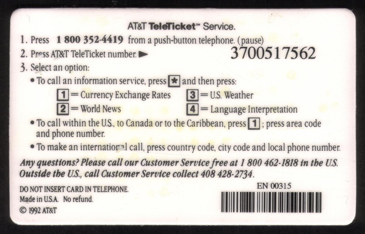
Description:(This description is AI generated and may contain inaccuracies.)
This collectible phone card prominently displays the AT&T logo in the upper left corner, immediately signaling its telecommunications origin. Branded as a "TeleTicket," the name is boldly printed in large, spaced-out letters across the top right. The center of the card features a vivid photograph of the Charles River in Boston, capturing a scene that blends natural beauty with urban sophistication. Sailboats gracefully drift across the calm waters, while lush green riverbanks frame the scene. This iconic view seamlessly combines the city’s modern skyline—marked by recognizable towers—with the tranquility of the natural environment.
To the left of the photograph, a large "25" stands out in white against a blue background decorated with horizontal lines, indicating the number of prepaid units on the card. Beneath this, the word "UNITS" appears in a simple, understated font, highlighting the card’s functional purpose. The design elegantly merges utility with a sense of place, blending a practical telecommunications tool with a snapshot of Boston’s maritime and urban character. The visual balance between the corporate typography and the scenic photograph enhances the card’s appeal as a collectible, emphasizing the city’s unique blend of natural and architectural beauty.
The Charles River scene is particularly striking, with a vibrant blue sky dotted with fluffy white clouds, providing a refreshing contrast to the reflective surfaces of Boston’s skyscrapers. The John Hancock Tower, the tallest building in the frame, features a sleek, mirrored façade that reflects the sky and surrounding trees. Complementing it are other notable structures like the Prudential Tower, anchoring the skyline to the right and creating an instantly recognizable Boston skyline. The white sails of the sailboats catch the sunlight, evoking a sense of leisure and community amidst an urban oasis.
Overall, the front of this phone card serves both a functional and artistic purpose. It acts as a prepaid telecommunications tool while also serving as a small tribute to Boston, highlighting the scenic Charles River. The combination of clean graphic design, corporate branding, and a compelling photograph elevates the card beyond its everyday utility, making it a desirable collectible for those interested in telecommunications history and American cityscapes.
Turning to the back side, the card is primarily dedicated to instructions and operational details. It begins with guidance on how to access telephone services, emphasizing the use of the card for calls within the AT&T network. The back provides various dialing codes and step-by-step instructions necessary to utilize the 25 prepaid units displayed on the front. Its layout is straightforward, designed for clarity and ease of use, with no imagery, relying instead on clear divisions of text and basic formatting.
A magnetic stripe runs horizontally along the top of the back, serving as the data storage medium that interfaces with phone card readers to deduct units. Below the stripe, small print details the card’s terms of use and the reach of the telephone network. This includes cautions about expiration dates and usage limitations, reminding users to check for service boundaries or expiry. The instructions are printed in black text on a white background to maximize readability.
The design of the reverse side reflects the technological era of the card, offering a glimpse into telecommunications practices before widespread mobile usage. It captures a transitional period when prepaid calling cards were essential for long-distance and payphone calls, especially in urban and business environments like those represented by the front’s cityscape. Even as a purely functional space, the back balances technical information with straightforward user guidance, reinforcing the card’s identity as both a practical tool and a collectible object.
In summary, the back complements the front by providing essential operational details and technological features such as the magnetic stripe. Its minimalist design focuses on functionality, ensuring users can effectively utilize the prepaid units. Together, both sides tell a cohesive story of a communication device rooted in a specific time and place, anchored by the iconic Charles River scene and the trusted branding of AT&T.
Since we have the world's largest inventory of USA phonecards for collectors, you will not necessarily receive the identical serial/batch/PIN number that we have scanned/pictured.
|